
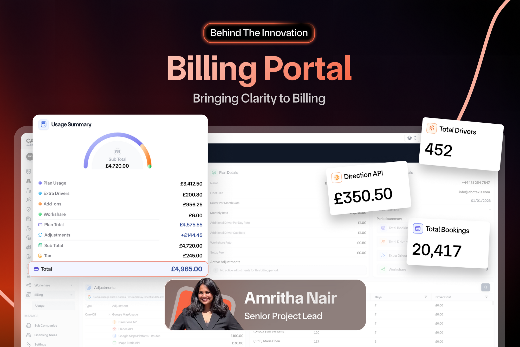
By Amritha Nair on Thursday 30th July 2026
"One screenshot changed how we thought about billing."
When introducing this feature, I found myself telling a story rather than jumping straight into a product demonstration.
It was about an Instagram story shared by one of our customers, Clare Welsh from Wellman Cars. She had posted a screenshot of an Excel spreadsheet she had built to keep track of her business costs. There wasn't anything remarkable about the spreadsheet itself - it was simply rows, columns and numbers. But that simple observation changed the conversation within our team.
Around the same time, our CEO, Tarpit, had been talking about creating something that would give customers greater visibility into Cab9. We already helped operators run their fleets efficiently, but financial visibility was still largely confined to the end of the month. Clare's spreadsheet reinforced something we had been discussing for a while: transparency isn't an added benefit, it's part of delivering a great product.
That became the starting point for what is now our Billing Portal.
Looking Beyond the Invoice
For most customers, billing worked exactly as expected.
At the end of every month, an invoice would arrive containing their subscription charges, integration costs, additional driver fees and any other applicable charges. Everything was accounted for, but the experience was reactive.
If a fleet owner wanted to understand why this month's bill was higher than last month's, or how additional drivers and integrations were contributing to their costs, they often had to wait until the invoice arrived or reach out to our team for clarification.
Nothing was broken. It worked exactly as expected. But we realised something important.
An invoice tells you what you owe.
It rarely tells you why.
As a fleet owner managing hundreds of drivers, waiting until the end of the month to understand your spending means you've already lost the opportunity to react. Whether it's monitoring additional driver usage, understanding integration costs or simply keeping track of operational spending, visibility throughout the month is far more valuable than a single figure at the end.
That became our mission.
Not to redesign invoices.
But to make billing understandable.
Designing for Simplicity
When we first started discussing the dashboard, we weren't asking ourselves what information we could display.
We were asking what information actually mattered.
Billing systems naturally generate an enormous amount of data. Every booking, every driver, every integration and every adjustment contributes towards the final invoice. It would have been easy to create a dashboard full of tables and metrics, but that wasn't the experience we wanted.
Our goal was simple: for a fleet owner to open the dashboard, spend less than a minute looking at it and immediately understand where their money was going.
That philosophy shaped every decision we made.
Instead of presenting one overwhelming report, the Billing Portal organises information into digestible sections. Customers can quickly view a summary of their usage, understand their billing plan, review company information, monitor adjustments and add-ons, and even drill down into driver-level activity.
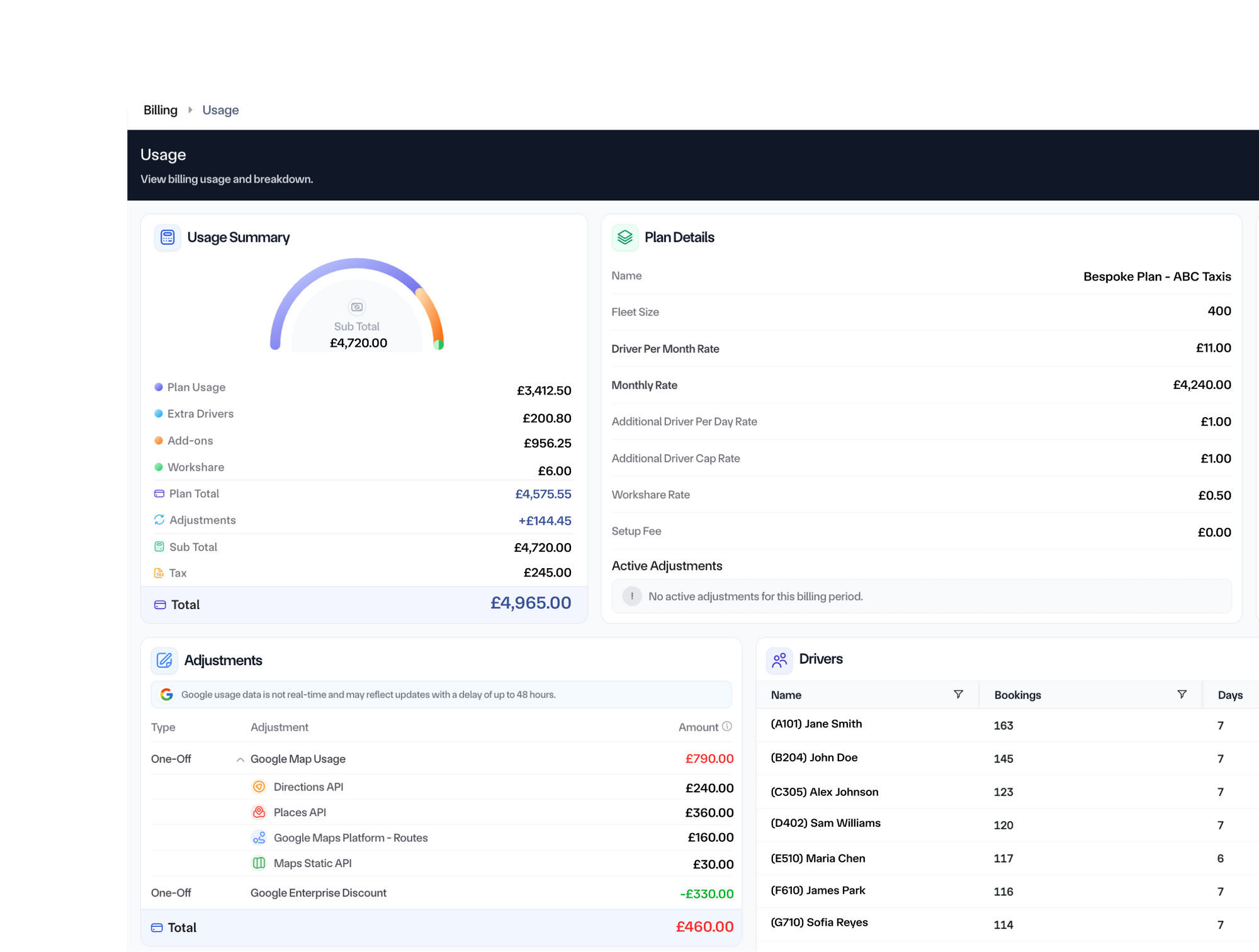
Selecting a different month instantly changes the view, allowing customers to compare billing periods and understand how their costs evolve over time.
Behind the scenes, the information updates every 24 hours, ensuring customers always have a near real-time view of their spending instead of waiting for the month to close.
The objective wasn't simply to display numbers. It was to create clarity.
Building a Billing System, Not Just a Dashboard
From an engineering perspective, the dashboard itself wasn't the biggest challenge.
The data was.
Billing is often seen as something operational rather than technical. Behind the scenes, it can involve spreadsheets, manual calculations, finance teams and disconnected processes.
To build the Billing Portal, we first needed to rethink billing as structured software.
Subscription plans, additional driver charges, third-party integrations, Workshare usage, add-ons, adjustments and taxes all existed as separate pieces of information. Each followed different rules, arrived from different systems and needed to be validated independently before contributing towards a customer's monthly bill.
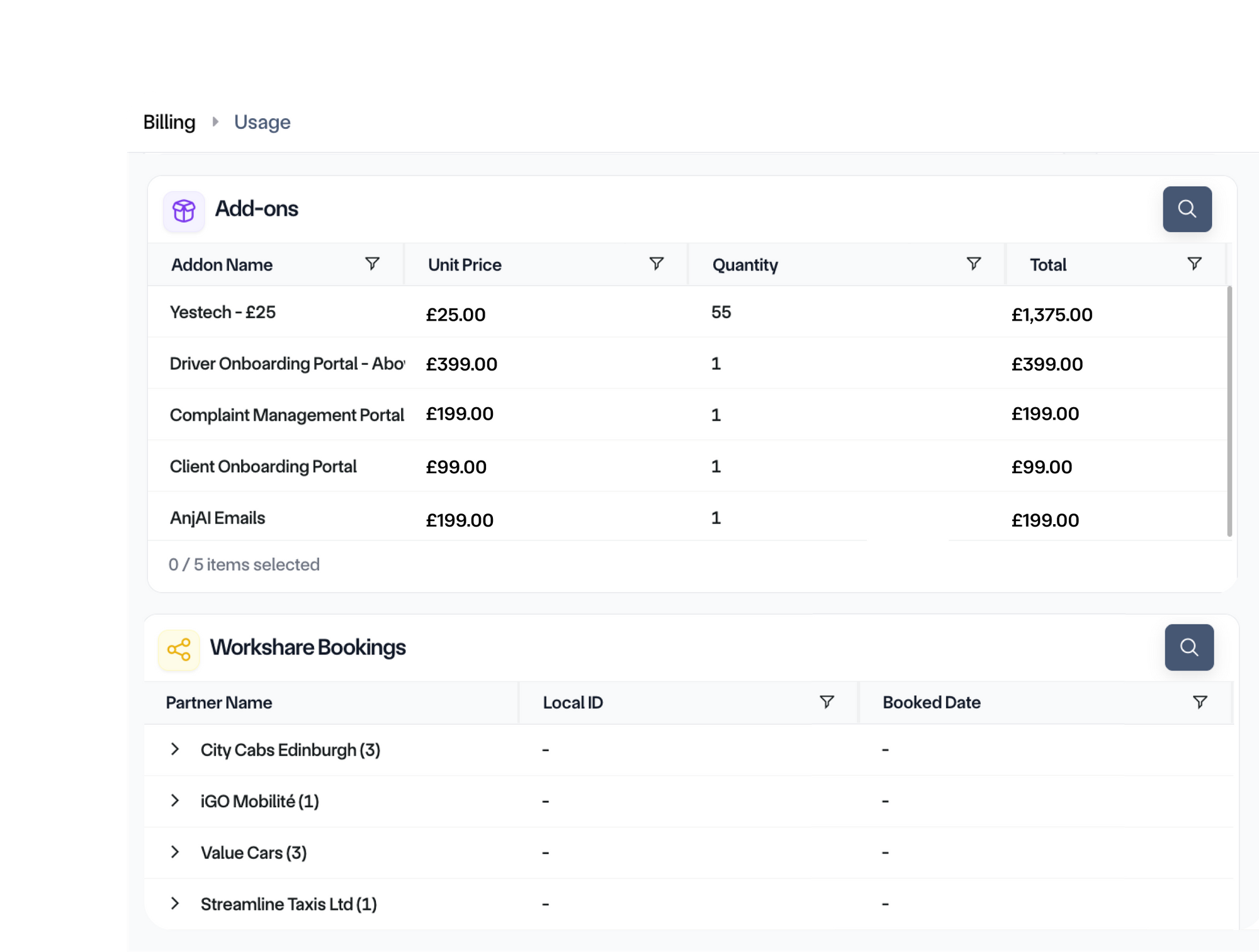
Only once those individual components were standardised could we bring them together into a single, reliable source of truth.
Ironically, the simpler we wanted the dashboard to feel, the more work happened behind the scenes.
Learning an Entirely New Domain
One of the most interesting parts of the project had very little to do with software engineering.
It was tax.
As engineers, we spend most of our time thinking about databases, APIs and user interfaces - not tax regulations.
But billing cannot exist without taxation.
Building this feature meant understanding how tax is calculated, how it differs across regions and ensuring every calculation was accurate before a customer ever saw it.
It challenged us to step outside our comfort zone and learn an entirely different discipline.
Like many engineering projects, we realised that building great software often starts with understanding the business it's solving.
Every Detail Matters
One of the biggest design discussions wasn't about adding more information. It was about removing it.
Every number on the screen had to justify its place.
Would a fleet owner benefit from seeing this?
Would it help them make a better decision?
Could it answer a question before they needed to contact support?
Those conversations shaped everything from the dashboard layout to the colour coding and section grouping.
The final design isn't trying to impress users with data. It's trying to make that data approachable.
A Team Effort
Projects like this never belong to one person.
They belong to the people who challenge ideas, question assumptions and ensure every detail is right.
Goutham S and Dhruv Arora played a key role in bringing the backend and frontend together, transforming complex billing logic into an intuitive experience.
Vijay Murthy and Ajay Jayaprakash helped shape many of the design decisions, constantly asking how we could simplify the experience even further.
Then there was Karan.
Within the team, Karan Grover is the person who knows billing inside out. Every calculation, every adjustment and every figure passed through him. His feedback wasn't about making the dashboard look better, it was about making sure the numbers told the right story.
That collaboration between engineering, design and domain expertise is what ultimately made the feature possible.
Early Feedback
Although still in its early stages, the response has been rewarding.
Customers have consistently commented on how easy the dashboard is to understand and how much clearer their billing has become. Instead of waiting for an invoice to explain what happened, they now have visibility into their usage throughout the month.
For us, that's exactly what success looks like.
Not because we've built another dashboard. But because we've removed uncertainty.
Looking Ahead
Today, the Billing Portal gives customers a transparent view of how their monthly costs are building.
Tomorrow, it could become something much bigger.
Once billing data is structured and accessible, the possibilities extend far beyond invoices. Trends, forecasting, spending insights, operational recommendations and richer analytics all become possible.
This dashboard isn't the final destination. It's the foundation.
Because if one customer's spreadsheet taught us anything, it's that understanding your business shouldn't begin when the invoice arrives, it should happen every single day.