
How did it all start?
It was the absolute first gathering of the year and everybody was inspired to set objectives for themselves when this thought was set into place. It was a new month of a new year and we were all exuberant to accept challenges and work towards building things to Cab9 to enrich the user experience.
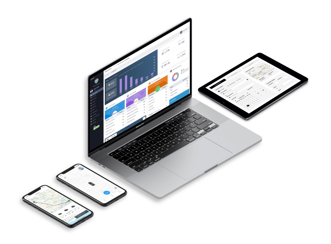
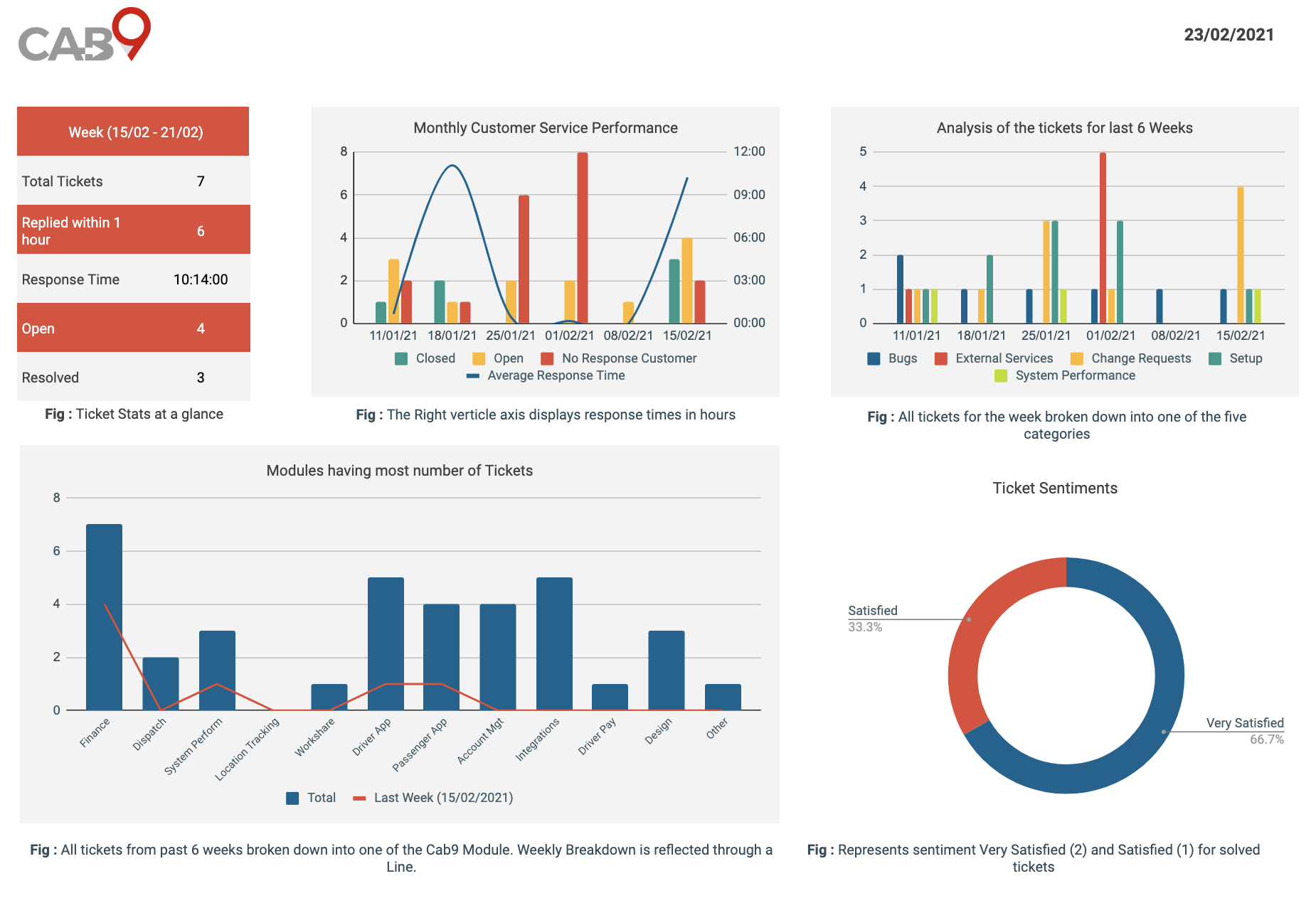
One among a myriad of objectives we set out for 2021 was to level up Cab9’s Support. In my previous communications with the clients, I had introduced them to the support portal. This time I wanted to extend that by presenting some analytics that could be of some actionable value. Our performance statistics are based on response times, outstanding ticket close time, analysis of tickets, requests, and bugs, and customer sentiments upon closure of the ticket.
With so many metrics to explore, it’s easy to lose track. Before you know it, you’ve spent the entire day fixated on one customised chart that serves no real purpose. That’s when I realised that when it comes to reporting, focusing on value is everything. If a metric does not generate value or pose a question it should not be presented on the report.

I’d like to present the experiences and the thought process that have guided the structure of my reports.
Figuring out the Right Metrics
The customer service software produces incredibly detailed reports, but from a bird's eye level does not highlight the data that really matters to the team. Additionally, these reports are complex and lack an abstraction that is generally required in driving business decisions. After researching for a long time I concluded that there are three important questions that largely help in determining the right metrics for the report.

Why are we reporting?
While brainstorming a couple of reasons behind this I found my reasons to build a report. I wanted to do something new, any project I will pick has to be useful, assess how is our support team performing, It will be interesting to present how quickly we respond to support tickets, etc. With mixed thoughts and a faint idea about reporting I decided to gather basic stats, for instance, tickets resolved, tickets pending, response times, reasons behind the lag, etc. to understand what could be my potential metrics. Nevertheless, this activity pointed out two important metrics for me. Together the response time and the reason behind the lag picture out how quickly a team responds to customers and how effective they are at making customers happy.

Who will have an access to this report?
The depth of these reports should be relevant to the intended audience. A team member will need different insights than a client or a stakeholder. Since I had to present this report to my team I chose metrics like response times, customer satisfaction levels, number of queries with the explicit purpose to analyse our internal process.
What do you want the outcome to be?
Report the numbers that indicate the outcome. For instance, if you want to decrease the response time then it would be worth first analyse the average weekly response times for a minimum of six weeks to figure out the trends and the reason behind high or low times if any.
Choosing the Reporting Platform
Once we know the metrics we want to track it is important to choose the right software that supports data storage and analysis, presentation, organisational planning, and more. In terms of the numbers of hours spent, there could be an up-front cost involved in building these reports initially but the subsequent reports should be a breeze. A bit of research, in the beginning, goes a long way. The systems we chose should automate most of the tasks that are repetitive.
The platform we went for was google sheets thanks to the high number of plugins and connections the service offered.
Presentation of the Data
A well-prepared presentation grasps audience interests and highlights the key areas. However, I believe we should also filter our report on the basis of what the specific audience needs to know. The scale and detail included varies depending on the audience, even if we’re addressing the same question. For instance, “How is our support team performing?” the report should look different based on the audience. An individual agent needs to know their team isn’t being efficient this week, but the business owner or stakeholders doesn’t need to know that this specific week has seen a small drop in productivity on the team. Rather should be presented trends for a month or six weeks.
Monitoring and Analysing the Data Regularly
To ensure the customer service report provides invaluable quality and the best possible data, we need to regularly monitor and analyse our findings and make sure the data is up to date and valid in any given situation. By analysing the numbers, raising questions to self, making necessary amendments to the charts, colours, etc, one can make its presentation interesting and engaging.
Finally, a report should help a team improve. By choosing the right metrics we can record any fluctuations or gaps in the data which helps pinpoint valuable insights that spark positive change. My first presentation drove me to document "Ticket Closing Generalised Process" and that is a positive change.